
Monday, December 17, 2007
Arbitrary Rectangle Spiral
I've created a program to generate a spiral from an arbitrarily dimensioned rectangle. Unlike the golden rectangle, or my series one and two rectangles, these spirals do not come from reducing the last rectangle by a multiple or fraction of a unit square. They do result, by design — not necessity, in every other rectangle being the same proportions as the first. Here's the first example:
Sunday, December 16, 2007
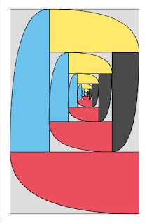
Conceptual Art, Algorithmic Art, Generative Art
Conceptual Art, Algorithmic Art, Generative Art? Or, some combination from a collaboration between a draftsman and a programmer.
Is this conceptual art? Sol LeWitt decreed way back in in the 60s that math was out, unless it was simple. Is it possible that he had an aversion?
Is it algorithmic art?
Is it generative art?
Generative art is a real good term for computer generated graphics. I don’t think this fits what I’ve done to date, because each of my projects leave most of the decision making to me during the use of whatever tool or algorithm I create. With the perspectives and interactive drawing tool I make choices, arrange, and make corrections during the rendering separate from the work I do during the programming of the tools.
I’m O.K. with being a draftsman and a programmer. So what am I doing? Conceptual Art, Algorithmic Art, Generative Art, or something else. I keep going back to Sol LeWitt's paragraphs. Like so many other artist/theorists I think he may have bent his definitions to match his output. He made the concept fit his art. I don't think conceptual has to be simple.
Still, I'd as soon be a good draftsman as a conceptual, algorithmic, or generative artist. For one thing, the terms are limiting. For another, we have to make exceptions for each. A good programmer could be any of the three. A programmer-draftsman has the opportunity to go beyond each.
Is this conceptual art? Sol LeWitt decreed way back in in the 60s that math was out, unless it was simple. Is it possible that he had an aversion?
"Conceptual art doesn’t really have much to do with mathematics, philosophy, or nay other mental discipline. The mathematics used by most artists is simple arithmetic or simple number systems. The philosophy of the work is implicit in the work and it is not an illustration of any system of philosophy." Sol LeWitt, Paragraphs on Conceptual Art.Sometimes, my art may have too much to do with mathematics to satisfy this limitation of LeWitt’s. I reserve the right to use the most complex math I can comprehend, which is still relatively simple, to build any tool I wish for creating art.
Is it algorithmic art?
"Simply put, algorists are artists who introduce and control original algorithms in the creation of their work." Roman Verostko.Jean Pierre Hebert wrote an algoritm that separates algorists from not-algorists:
if (creation && object of art && algorithm && one's own algorithm) {The trouble I have with this is "&& algorithm" / "|| !algorithm". I employ algorithms when creating tools. They’re used when I create art. It’s a collaboration between me as a draftsman and me as a programmer. I program algorithms. I use algorithms.
include * an algorist *
} elseif (!creation || !object of art || !algorithm || !one's own algorithm) {
exclude * not an algorist *
}
Is it generative art?
Generative art is a real good term for computer generated graphics. I don’t think this fits what I’ve done to date, because each of my projects leave most of the decision making to me during the use of whatever tool or algorithm I create. With the perspectives and interactive drawing tool I make choices, arrange, and make corrections during the rendering separate from the work I do during the programming of the tools.
"Generative art refers to any art practice where the artist creates a process, such as a set of natural language rules, a computer program, a machine, or other procedural invention, which is then set into motion with some degree of autonomy contributing to or resulting in a completed work of art." Philip Galanter.That sounds a lot like:
"When an artist uses a conceptual form of art, it means that all of the planning and decisions are made beforehand and the execution is a perfunctory affair. The idea becomes a machine that makes the art." Sol LeWitt, Paragraphs on Conceptual Art.Besides, I think generative art gets boring very quickly. Fractals are to generative art as the golden rectangle is to painting. I don’t think either has that much to do with beauty, harmony, or art.
I’m O.K. with being a draftsman and a programmer. So what am I doing? Conceptual Art, Algorithmic Art, Generative Art, or something else. I keep going back to Sol LeWitt's paragraphs. Like so many other artist/theorists I think he may have bent his definitions to match his output. He made the concept fit his art. I don't think conceptual has to be simple.
Still, I'd as soon be a good draftsman as a conceptual, algorithmic, or generative artist. For one thing, the terms are limiting. For another, we have to make exceptions for each. A good programmer could be any of the three. A programmer-draftsman has the opportunity to go beyond each.
Wednesday, December 12, 2007
The Silver Means
I have edited four lines in three sections of my paper that I submitted to the JOMA. The revised version is here: "The Golden Rectangle – One Rectangle in a Continuum of Infinitely Many Similar Rectangles". On further investigation I found that I should describe the first series of rectangles in my paper as being based on the silver means which is described on the Fibonacci website of Dr. Ron Knott (http://www.mcs.surrey.ac.uk/Personal/R.Knott/Fibonacci/cfINTRO.html#silver). I should credit Knott with documenting the silver means. I had already included Knott in my references, but I should be more specific in regards to the silver means. Until yesterday, I wasn’t aware that Knott had already identified this series of numbers that are central to my paper.
The edits I am making include four lines in: the second paragraph of the Abstract; the second paragraph of the section, First Series of Similar Rectangles; and, the title of Table 1. In each case I am identifying my first series of rectangles as being based on Dr. Knott’s silver means.
Monday, November 26, 2007
The Golden Rectangle — One Rectangle in a Continuum of Infinitely Many Similar Rectangles
The Rectangles Paper
Table 1. First Series Rectangles
Table 2. Second Series Rectangles
I've completed a draft of the paper, The Golden Rectangle — One Rectangle in a Continuum of Infinitely Many Similar Rectangles.
I'll now be preparing a tool to configure and print versions of the spirals.
Table 1. First Series Rectangles
Table 2. Second Series Rectangles
I've completed a draft of the paper, The Golden Rectangle — One Rectangle in a Continuum of Infinitely Many Similar Rectangles.
I'll now be preparing a tool to configure and print versions of the spirals.
Sunday, November 25, 2007


Saturday, November 24, 2007
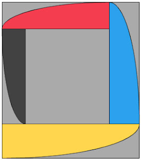
Second Series Rectangle, Spiral Example
This is the first example of a second series rectangle rendered with its "spiral". This is a "2nd order, fractional unit" rectangle. That means that the ratio of long side to short side is b/(a-b/24). The ratio of a/b is (1 + √65)/8, or approximately 1.13278. A "zero order, fractional unit" rectangle is the same as the golden rectangle.

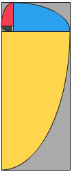
First Series Rectangle, Spiral Example
This is the first example of a new series rectangle rendered with its "spiral". This is a "1st order, multiple unit" rectangle. That means that the ratio of long side to short side is (a+b)/(a-b). The ratio of a/b is 1 + √2, or approximately 2.414213. A "zero order, multiple unit" rectangle is the same as the golden rectangle.

Friday, November 23, 2007
An Infinity of Rectangles
On the day before Thanksgiving, I finally posted "The Golden Rectangle — One Rectangle in a Continuum of Infinitely Many Similar Rectangles".
Now I'll be working on a Flash program to render the spirals that I can create with the new rectangles. The new spirals will be similar to the golden spiral. However, unlike approximations of a logarithmic spiral, they'll be elongated, or flattened looking.
Now I'll be working on a Flash program to render the spirals that I can create with the new rectangles. The new spirals will be similar to the golden spiral. However, unlike approximations of a logarithmic spiral, they'll be elongated, or flattened looking.
Monday, November 5, 2007
Solution to fractional rectangles
In a previous blog I proposed a problem: to find the formulas (ratios for the long to short sides) for rectangles that are generated in a different series. That is, the golden rectangle is constructed by drawing a line across a half unit square. So, what are the formulas for a series of rectangles constructed by first drawing a line across a third, then a fourth, a fifth, a sixth, etcetera, of a unit square?
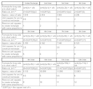
What I found was a series constructed by drawing a line across a fourth, eighth, sixteenth, etcetera, of a unit square. Here is a table of what I call the second through eighth order fractional rectangles, with the golden rectangle being the first order.
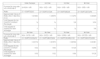
These rectangles have the following features in common with the golden rectangle:
1. Simple construction. The rectangles can be constructed with a straightedge and compass. This is done by starting with a square and drawing a line across a fraction of the square. That line is used as a radius to draw an arc that defines the height of the rectangle.
2. Simple formula. Maybe not as simple as the golden ratio. The golden ratio is expressed algebraically as:
(a+b)/a = a/b
The second order fractional rectangle ratio is expressed as:
b/(a – b/2) = a/b
Each successive fractional rectangle in the series has a similar formula, the 2 being increased to 4, 8, 16, 32, etcetera.
3. Simple generation of rectangles spirally in from an original rectangle. When a simple fraction if a unit square is removed, the remainder is another rectangle with the same proportions as the first. Removal of the same fraction of a unit square can be repeated infinitely, which leads to spiral-like image.

West Coast art history
Portland was an excellent place to be this weekend for expanding my knowledge of West Coast art history. I saw Morgan Neville's Cool School on Friday at the Northwest Film Center. Neville was there to comment on the film. Tom Marioni gave a talk at Reed College on Saturday. I was very pleasantly surprised that much of the work he showed clicked with me. Finally, Kathan Brown of Crown Point Press gave a talk at PAM on Sunday.
Sunday, October 28, 2007
A series of drawings diagramming the construction of "green rectangles"
Create a series of drawings showing the construction of up to twelve rectangles, starting with the golden rectangle, that have similar properties, such that when square sections are removed, the remainder is another rectangle with the same proportions as the first.
Construct Spirals and Compare to the Golden Spiral
In my previous blogs on rectangles I showed that the golden rectangle is not so distinctive. One feature of the golden rectangle is that it can be used to generate a spiral that approximates the golden spiral. The series of rectangles I described can each be used to generate spirals similar to a golden spiral, (or a Fibonacci spiral), but being made from quarter-ellipses, rather than quarter-circles. One of the low order rectangles might be used to approximate a hyperbolic spiral, though the higher the order, the less it is apt to look like a spiral. Each quarter turn becomes so elongated that it looks less like a spiral and more like receding quarter-ellipses.
It might be helpful to diagram some spirals from the series of new rectangles that are similar to the golden rectangle.
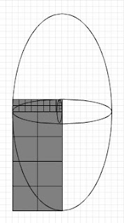
It might be helpful to diagram some spirals from the series of new rectangles that are similar to the golden rectangle.

What is the pattern?
What is the pattern in the progression of ratios for rectangles with features similar to the golden rectangle?
In my previous blogs on rectangles I showed that the golden rectangle is not so distinctive in its feature that when a square section is removed, the remainder is another rectangle with the same proportions as the first. I described rectangles that when 2, 3, 4, 5, etcetera, square sections are removed, the remainder is another rectangle with the same proportions as the first.
Here is the pattern of ratios for this series.
(1+√5)/2 [The golden ratio]
1+√2
(3+√13)/2
2+√5
(5+√29)/2
3+√10
(7+√53)/2
4+√17
(9+√85)/2
5+√26
(5+5*√5)/2
6+√37
These are the ratios of long side to short side for rectangles that, starting with the golden rectangle, are in proportion such that if one, two, three, etcetera, unit rectangles are removed, the remaining rectangle is in the same proportion as the original. What's going on here?
Review of art and architecture using the golden ratio
Any number of artists and architects have used the golden rectangle to guide the proportions of their works. What if you skewed these works so that their proportions conformed not to the golden ratio, but one of the other ratios that have similar properties? For example, take a painting by Mondrian or a building by Le Corbusier. Rescale the long dimension so that it conforms to one of the other ratios that exhibit features similar to the golden ratio.
 |  |
| Original in the proportions of a golden rectangle | Rescaled to the proportions of a "green rectangle" |
A golden rectangle problem to solve
In my previous blogs on rectangles I showed that the golden rectangle is not so distinctive in its feature that when a square section is removed, the remainder is another rectangle with the same proportions as the first. Similarly, I described a rectangle that when two square sections are removed, the remainder is another rectangle with the same proportions as the first. This can be carried on, infinitely I assume, so that there exist rectangles that when 3, 4, 5, etcetera, square sections are removed, the remainder is another rectangle with the same proportions as the first.
The rectangles I described can be constructed by adding one half unit squares, in series. First you construct a unit square, and then add one half of a unit square on top of the first. Then you draw a line from one corner to the opposite corner of the one and one half unit squares. Then you use that line as the radius to draw an arc that defines the long dimension of the rectangle. To create more rectangles in the series you add one unit square, then one and a half, then two, etcetera.
The problem to solve is to find the formulas (ratios for the long to short sides) for rectangles that are generated in a different series. That is, the golden rectangle is constructed by drawing a line across a half unit square. So, what are the formulas for a series of rectangles constructed by first drawing a line across a third, then a fourth, a fifth, a sixth, etcetera, of a unit square?
The first twelve of an infinite series of rectangles
In my previous blogs I showed that the golden rectangle is not so distinctive in its feature that when a square section is removed, the remainder is another rectangle with the same proportions as the first. Similarly, a feature of the "green rectangle" that I described is that when two square sections are removed, the remainder is another green rectangle with the same proportions as the first. This can be carried on, infinitely I assume, so that there exist rectangles that when 3, 4, 5, etcetera, square sections are removed, the remainder is another rectangle with the same proportions as the first.
Each of these series of rectangles can be described by a formula or ratio of long side to short side, similar to the golden ratio. The golden ratio can be expressed algebraically as:
(a+b)/a = a/b, where a is the long side and b is the short.
The rectangles with similar features can be described algebraically simply by subtracting an integer number of short sides from the denominator of the right side of the equation.
Here are features of the first twelve such rectangles, starting with the golden rectangle.
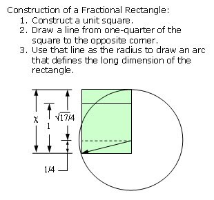
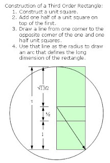
Construction of an 8th order rectangle:
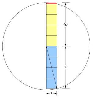
An 8th order rectangle with a short side of one has a long side of 4 plus the square root of 17. The ratio of long side to short side is therefore approximately 8.1231056. Removing 8 unit squares leaves the red rectangle, which has a short side of approximately 0.1231056 and a long side of 1. The new rectangle ratio of long side to short side is therefore approximately 1/0.1231056 or 8.123107.
Each of these series of rectangles can be described by a formula or ratio of long side to short side, similar to the golden ratio. The golden ratio can be expressed algebraically as:
(a+b)/a = a/b, where a is the long side and b is the short.
The rectangles with similar features can be described algebraically simply by subtracting an integer number of short sides from the denominator of the right side of the equation.
Here are features of the first twelve such rectangles, starting with the golden rectangle.

Construction of an 8th order rectangle:

An 8th order rectangle with a short side of one has a long side of 4 plus the square root of 17. The ratio of long side to short side is therefore approximately 8.1231056. Removing 8 unit squares leaves the red rectangle, which has a short side of approximately 0.1231056 and a long side of 1. The new rectangle ratio of long side to short side is therefore approximately 1/0.1231056 or 8.123107.
Saturday, October 27, 2007
Typical feature of some rectangles, including the Golden Rectangle
In a previous blog I showed that the golden rectangle is not so distinctive in its feature that when a square section is removed, the remainder is another rectangle with the same proportions as the first. Similarly, a feature of the "green rectangle" that I described is that when two square sections are removed, the remainder is another green rectangle with the same proportions as the first. This can be carried further, so that there exists a rectangle that when three square sections are removed, the remainder is another rectangle with the same proportions as the first.
Two quantities (positive numbers), a and b, are said to be in the golden ratio if (a+b)/a = a/b. In my previous blog I proposed that two quantities, a and b, be in the green ratio if (a+b)/(a-b) = a/b. The golden rectangle has been declared to be distinctive in that when b is removed from a, the ratio of b/(a-b) is the same as a/b. I showed that this feature is not so distinctive. That is because my green rectangle has the feature that when 2b is removed from a the ratio of b/(a-2b) is the same as a/b.
I will now define a new, "third order", rectangle whose side, a and b, are in the ratio of (a+b)/(a-2b) = a/b. If we define this ratio as τ, the Greek letter tau, this leads to:
τ² - 3τ - 1 = 0
The only positive solution to this equation is:
τ = (3 + √13)/2, or 6.606 (approximately).
Here's the calculation:
(a+b)/(a-2b) = a/b = τ
The right equation shows that a = bτ, which can be substituted in the left part, giving:
(bτ + b)/(bτ - 2b) = bτ/b
Canceling b yields:
(τ + 1)/(τ - 2) = τ
Multiplying both sides by (τ - 2) and rearranging terms leads to:
τ² - 3τ - 1 = 0
The only positive solution to this quadratic equation is:
τ = (3 + √13)/2 = approximately 3.303
A not so distinctive feature of the golden rectangle is that when a square section is removed, the remainder is another rectangle with the same proportions as the first. Similarly, a feature of the green rectangle is that when two square sections are removed, the remainder is another green rectangle with the same proportions as the first. Now I will show that a feature of the third order rectangle is that when three square sections are removed, the remainder is another rectangle with the same proportions as the first.
Proof that b/(a-3b) is the same as a/b.:
If the long side of the remaining rectangle is 1, the short side is (3 + √13)/2 - 3.
1 / ((3 + √13)/2 - 3) =
1 / ((3 + √13)/2 - 6/2) =
1 / ((-3 + √13) /2)=
2/(-3 + √13) =
2( √13+3)/( √13-3)( √13+3) =
(2√13+6)/( 13-9) =
(3+√13)/2

Tuesday, October 23, 2007
Green Rectangle
In an earlier blog I questioned the assumption that the golden ratio or golden rectangle somehow contributes to an artwork's beauty, proportion or harmony. Since then it occurred to me that the golden rectangle might not be so special if you could show that other rectangles have similar properties.
I now propose an alternative to the golden rectangle, which I call the green rectangle. Instead of a rectangle whose side lengths are in the golden ratio, that is, approximately 1:1.618, I propose a rectangle whose side lengths are in the ratio of approximately 1:2.414, the green ratio.
Two quantities (positive numbers), a and b, are said to be in the golden ratio if (a+b)/a = a/b. I propose that two quantities, a and b, be in the green ratio if (a+b)/(a-b) = a/b. If we define this ratio as χ, the Greek letter chi, this leads to:
χ² - 2χ - 1 = 0
The only positive solution to this equation is:
χ = 1 + √2, or 2.414 (approximately).
Here's the calculation:
(a+b)/(a-b) = a/b = χ
The right equation shows that a = bχ, which can be substituted in the left part, giving:
(bχ + b)/(bχ - b) = bχ/b
Canceling b yields:
(χ + 1)/(χ - 1) = χ
Multiplying both sides by (χ - 1) and rearranging terms leads to:
χ² - 2χ - 1 = 0
The only positive solution to this quadratic equation is:
χ = 1 + √2 = approximately 2.414
A green rectangle is a rectangle whose side lengths are in the green ratio. I call this the green rectangle because it is leaner than the rather squat golden rectangle. Stood vertically, a green rectangle is taller, thinner, more like the ideal modern figure. Projecting the short side to a square base yields a tall box with a smaller footprint, as well.
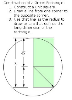
A not so distinctive feature of the golden rectangle is that when a square section is removed, the remainder is another rectangle with the same proportions as the first. Similarly, a feature of the green rectangle is that when two square sections are removed, the remainder is another green rectangle with the same proportions as the first.
Proof:
The long side of the remaining rectangle is 1 and the short side is 1 + √2 - 2.
1 / (1 + √2 - 2) =
1 / (-1 + √2) =
(-1 - √2)(1) / (-1 - √2)(-1 + √2) =
(-1 - √2) / (1 - √2 + √2 - 2) =
(-1 - √2) / -1 =
1 + √2
Double square removal can be repeated infinitely, which leads to an approximation of what I will call the "green spiral", similar to a golden spiral. Compared to a golden spiral, a green spiral is stretched, being made from quarter-ellipses, rather than quarter-circles. At any rate, using quarter-circles to generate a spiral is actually called a Fibonacci spiral, and only approximates a golden spiral. Perhaps a green spiral approximates a hyperbolic spiral — the math is beyond me. [Add a drawing of a green spiral and a hyperbolic spiral (with a=?) around the same center point.]
I don't deny that the golden rectangle is aesthetically pleasing. However, I don't think there's any proof that a connection exists between the math of the golden ratio and the beauty of a regular rectangle with proportions not too wide, not too thin.
Monday, October 15, 2007
New York, O.C. artist, Allan McCollum
I attended the PSU art department's Monday Night Lecture, organized by faculty member Harrell Fletcher. The presenter, Allan McCollum, went all the way back to 1968, giving a chronological account of his projects.
McCollum overwhelmed me with his compulsions, making hundreds or thousands of similar objects. He has created thousands of Perfect Vehicle sculptures with the same shape, that of a Chinese ginger jar, but in different colors, and sometimes different sizes, from a few inches to 80 inches high. At other times, he obsessively researches, documents, or replicates interesting things that come his way, such as a Pompeii dog, or sand spikes. McCollum taps into visionary art or "art produced by self-taught individuals, usually without formal training, whose works arise from an innate personal vision that revels foremost in the creative act itself." (quote from the American Museum of Visionary Art, in Baltimore)
McCollum is creating a more refined version of visionary art. It's more calculated than folk art. I appreciate works by individuals who have an innate personal vision in them and it's got to come out. McCollum starts with the premise that he's going to create in an obviously obsessive manner, and he looks for an appropriate subject.
McCollum had justifications for each and every step along the way in his forty-odd year pursuit of obsessively repetitious projects. The justifications were generally about art, not about compulsion. His presentation attitude was somewhat mocking and sly, eliciting chuckles if not admiration.
Wednesday, October 10, 2007
Chicago installation artist Jean Marie Casbarian
I attended the PSU art department's Monday Night Lecture, organized by faculty member Harrell Fletcher. The presenter, Jean Marie Casbarian, produces highly personal installations. I thought her works could be promoted more accurately as photography incorporating some aspects of multi-media and installation art, rather than installation art incorporating photography.
I wondered if the personal side of her work has begun to take over the creative. She's researching, documenting, and drawing from her family history. I'm not sure that bits and pieces of information on the Aberdeen Proving Ground translates into interesting art. Sometimes, when we focus on finer detail (in this case the detail of Casbarian's life and family), the image becomes banal.
I wondered if the personal side of her work has begun to take over the creative. She's researching, documenting, and drawing from her family history. I'm not sure that bits and pieces of information on the Aberdeen Proving Ground translates into interesting art. Sometimes, when we focus on finer detail (in this case the detail of Casbarian's life and family), the image becomes banal.
Tuesday, October 9, 2007
Terrie Sultan, Chuck Close Prints: Process and Collaboration
I attended Terrie Sultan's talk about the exhibition of Chuck Close prints at the PAM. Sultan organized the exhibit, which will be in ten cities. Her presentation and the exhibit are both heavy on Close's process and his collaboration with printers. Sultan emphasized the fact that Close considers his work minimalism, and does not identify with representational or figurative artists. A portraitist he's not.
I see him as sort of a human digitizer, since no matter what medium he works in he almost always manually rasterizes images. But Close's process is a complex mix of digital and analogue. Sultan repeatedly used the word, integer, to describe the smallest unit component of each image. When Close communicates to his printers he gives each unit an integer. Depending on the process each unit may be unique and exactly repeatable, or each unit may be communicated as an integer, but rendered by a continuously variable, analogue process. Sometimes it gets complicated, mixing the analogue with the digital. For example, Close directs the production of hand-made pulp paper prints. The pulp is colored to create a gray scale, so each unit identified by the same integer is the same color if not the same exact shape. In contrast, sometimes Close directs the production of prints made up of units that are themselves small, irregular, concentric, circular or elliptical marks inside of squares. There are a finite number of colors associated with each mark, but an infinite or continuously variable number of ways to make the marks within each unit square. The spitbite prints are another example in which units are given an integer representing the number of seconds to allow an area to etch. But the actual rendering of each unit may be analogue since using a stop watch to direct a printer when to stop etching makes each unit unique, and infinitely varied.
My estimation of Close was increased substantially by the show and Sultan's talk. I admire Close because he is so persistently concrete. We can describe his intentions without resorting to superficial art jargon.
I admire him because he seems to work so well with his collaborators. He achieves more by cooperating completely with the printmakers, and they with him.
I don't always like his product. Some of the pieces produced in fabric and hand-made paper seem more craft than art to me. But even then I admire the fact that Close is so willing to attempt the innovation.
Tuesday, October 2, 2007

Monday, September 24, 2007
Training Ground for Democracy
I know this is old news, and the folks that follow art happenings are probably sick of it, but I'm fascinated by the debacle that was to be the Mass MoCA “Training Ground for Democracy” exhibit. I think this quote from Roberta Smith in a dialogue in Artl!es applies to the curators for artist Stephen Buchel's work: "There is a lot of what I would call 'wishful looking' in art criticism these days." I think there's a lot of wishful looking throughout the public art world, and Mass MoCA was caught looking. Smith wasn't referring to criticism of “Training Ground for Democracy”. In fact, I think she views Buchels work as legitimate, interesting art. I think that some art critics look at Buchel's work and wish it was more than it is — not simply mediocre to bad art, but monumental, relevant, major art.
Here's the current state of the Mass MoCA, Stephen Buchel, "Training Ground for Democracy" show: Judge rules. . .
Why Roberta Smith thinks Mass MoCA shouldn't open a show with what's left: Is It Art Yet? And Who Decides?
Tyler Green's latest comments: On the mess. . .
I've recently read criticism of some art museums' tendencies to book big blockbuster events, at the expense of relevancy or artistic merit. “Training Ground for Democracy” is a perfect example. It appears that it was simply going to be a show about how amazing it is that they got a house and some trucks and other big stuff inside a museum. Too much is made of the juxtapositions. Even if Buchel had finished “Training Ground for Democracy”, and approved of the exhibit, it was still just big stuff from the real world moved inside a museum. I think trying to make much of Buchel's environments is an extended example of "wishful looking". In describing them as "bristling three-dimensional history paintings", Roberta Smith explains his environments, but ultimately exaggerates the positive. I doubt that “Training Ground for Democracy” was going to bristle.
Wednesday, September 19, 2007
3 Artists from the Affair @ the Jupiter Hotel
I went to my first art fair on Sunday, the Affair @ the Jupiter Hotel. These are three artists that caught my attention.
Amanda Hughen, a San Francisco area artist. I think shown by Swarm, Oakland, CA. Hughen makes complex line drawings repeatedly tracing and abutting some standard template shapes such as hexagon, or ellipses. I believe the drawing I saw was on plywood.
Victoria Haven, Seattle. Shown by PDX, Portland, OR. Haven showed a small drawing or painting of rows of abutting gray planes each in two-point perspective. Her work is reminiscent of another artists whose work I admire: Suzanne Corporeal.
Jeff Keller, a sculpture from Maine. Shown by Richard Levy, Albuquerque, NM. Keller showed a panel with a simple trapezoid shape with a couple of lines, creating a perspective 3-D effect.
Sunday, September 16, 2007
Ursula von Rydingsvald, Presenting at PAM
I attended the Ursula von Rydingsvald presentation of her work at the PAM this afternoon. I think that without exception the pieces she showed as slides, and there were many, were superior to the kinetic sculpture upstairs at the PAM. This sculpture is only one of two moving pieces she has done. Perhaps kinetic sculpture doesn't really work with her art. It's as if you went to Arches National Park in Utah, and one of the beautiful arches somehow had been made to bounce up and down. The motion is just not necessary to the effect.
Von Rydingsvald's sculptures are beautiful the way that large rock formations are beautiful. (See the entablature jointing at Latourell falls and elsewhere in the Columbia river gorge.) I wouldn't try to think too much about what they mean. I don't think she does. She has simply arrived at a very successful process, that seems to require less design effort than organization and execution. It's as though she's sped up nature's process of erosion or created in cedar the look of columnar jointing produced when lava cools and contracts.
Von Rydingsvald's sculptures are beautiful the way that large rock formations are beautiful. (See the entablature jointing at Latourell falls and elsewhere in the Columbia river gorge.) I wouldn't try to think too much about what they mean. I don't think she does. She has simply arrived at a very successful process, that seems to require less design effort than organization and execution. It's as though she's sped up nature's process of erosion or created in cedar the look of columnar jointing produced when lava cools and contracts.
Saturday, September 15, 2007
Manufactured Landscapes
Go see Manufactured Landscapes, a documentary by Jennifer Baichwal about Edward Burtynsky's photography, if it comes to your town.
If you're not familiar with Burtynsky's photography, google images here. My favorites are the shipbreaking photos from Bangladesh. They're included in the film, which chronicles the whole effect of modern industrialization from resource extraction, through manufacturing, shipping, and finally recycling.
If you're not familiar with Burtynsky's photography, google images here. My favorites are the shipbreaking photos from Bangladesh. They're included in the film, which chronicles the whole effect of modern industrialization from resource extraction, through manufacturing, shipping, and finally recycling.
Wednesday, September 12, 2007
Arch Rival
Mark Grotjahn has shown paintings and drawings using one point perspective in several major gallerys. MOMA even has a few of his drawings. Like mine, his have multiple vanishing points. I believe he uses one-point perspective where I use two-point, and typically, though not necessarily, he contains the vanishing points within the picture plane taking lines all the way to the horizon. The effect is many abutting planes receding to the vanishing point, creating a radial image.
Also see the Anton Kern Gallery, and Shane Campbell Gallery, or Google him.
Also see the Anton Kern Gallery, and Shane Campbell Gallery, or Google him.
Friday, September 7, 2007
Golden Ratio Drawing
 Here's a new drawing more or less done within the golden ratio. I don't think the golden ratio (about 1.6:1) makes it look any better or worse than the 1:1 ratio I usually work in. Granted the long dimension is skewed in my drawing.
I think it must be a myth that the golden ratio contributes anything to beauty, proportion or harmony.
Ursula von Rydingsvard at PAM
I saw the Ursula von Rydingsvard sculpture and drawings on my way to first Thursday. I thought the huge cedar sculpture was comical. Though it is so massive, it's also playful, and puts me in a mood to respond accordingly. It brought to mind a few reactions, none that have much to do with art.
For one, I thought about the commercial from Ren and Stimpy:
"It's log, it's log,
It's big, it's heavy, it's wood.
It's log, it's log, it's better than bad, it's good."
I wanted to put walnuts, jawbreakers, or snaps under the massive lid that rises and clunks down every few seconds. I don't necessarily think these are silly reactions, because the sculpture begs for help from the viewer, to make it something more than it is. Sensing that its action falls short of the promise of its mass, I want to give it another purpose.
A giant beaver coffin? Is he prematurely entombed, and trying to get out?
I think the motion suggests not so much a human back bending, but a box lid trying to open, but failing for lack of strength. It's as though the effort to overcome the massive weight is just too much. I'm so used to seeing hydraulic cars that bounce, a big pile of logs that barely get up seems anemic.
Remember the Log Lady from Twin Peaks? I plan to see von Rydingsvard give a presentation on 9/16. We'll see what I think, then.
Saturday, September 1, 2007
Camouflage at PAM (I can't stand the slaughter, but still I patronize the arts.)
I eat chicken, so I can't get too upset if a few hundred butterflies are sacrificed for art. I do find it odd that the Portland Art Museum web site describes the butterfly wings on the new Damien Hirst art as "naturally-shed".
The Portland Art Museum is showing Camouflage, an exhibition of eight paintings exploring the use of pattern. This is a rare exhibit at the PAM that disappoints me. Before its opening, Jeff Jahn called it "Portland's must see contemporary group show of the summer." (Update, 10/17/07.) I had similar expectations, but I wasn't impressed by most of the pieces, least of all the Warhol and Hirst. My reaction is that with the exception of the Philip Taffe paintings, the show is somewhat banal.
I've been searching for artists that have used pattern to see if I can find any that I like. Michael Kidner may be one; also, early Larry Poons paintings with the little ellipses. Otherwise, I'm having trouble coming up with any.
The Warhol that gives the exhibit its title is the least consequential Warhol I can think of. It's a 37-foot long painting of a camouflage pattern, from 1986. It's both banal and ugly. On a good day, camouflage doesn't do much for me. John Motley, in the Portland Mercury says, "Certainly, it's a kind of final statement of irony for an artist so obsessed with repetition and color. But it also embodies the exhibition's central tension, straddling a line between self-signifying decorum and sublimated expression." Thinking along those lines, maybe I didn't like the show because the works are either decoration or they sublimate expression to the point that little is left but banality.
Then there's the new Damien Hirst, a tacky collage of butterfly wings. This is among the many horrible ideas that come from one of our most overrated artists. It's certainly not ugly, thanks to the butterflies, but coming from Hirst it's banal, or at least trite, in my opinion. So the wings are stuck to cathedral window shaped boards. Supposedly they are "naturally-shed" butterfly wings. Hmmm. Did Hirst didn't spend the last couple of years collecting dead butterflies? This is the same artist that had the bad idea to create an installation of caterpillars and canvases covered with sugar solution and glue. The caterpillars turned into butterflies, and then stuck to the canvases. Here are a couple of links to more on Hirst butterfly art, with no reference to the "naturally-shed": Gargosian Gallery, "Hirst accused of sadism. . ." The Gargosian site says the butterflies symbolize the "inherent fragility of life." Yes, to a wingless butterfly, life is certainly fragile.
Also, there's some evidence that this isn't an original idea. L.A. artist Lori Precious has been doing stained glass butterfly wings for ten years. Should she be in the show instead of Hirst? Personally, I'd like to see Portland declare that they've fulfilled their quota of Hirst showings for the next half-century or so. Also, in 1988, Tom Marioni created The Golden Wing, a collage of butterfly wings on wood.
There are a couple of Christopher Wool paintings, and Agnes Martins. I want to like Agnes Martin's work, being a proud fan of minimal art, but I think her work usually drains all the excitement out of minimalism.
The only work that I didn't find either banal or ugly is the snake painting from Philip Taaffe. Still, his other contribution is not particularly appealing.
Nevertheless, I wholeheartedly appreciate the effort by PAM (curator Bruce Guenther) to gather small but relevant shows like this. Pattern painting is what it is. It deserves to be seen, and a small grouping such as Camouflage is at least representative. Besides, there have been numerous small but excellent shows at PAM since I arrived in Portland: Leonard Baskin, Wes Mills, Minimalism/Post Minimalism, The Drawn Line. Read more from Jeff Jahn about PAM's new exhibition philosophy here.
Friday, August 10, 2007

Thursday, July 12, 2007
Precisionism
Precisionism and a Few of its Friends, by Roberta Smith
Interview with Charles Sheeler, conducted by Martin Friedman, in which Sheeler said he saw no affinity between his work and that of Georgia O'Keeffe's. Sheeler also said he had no interest in surrealism. He also seems to say he never saw any particular justification for the label, precisionist.
Precisionism according to Wikipedia.
Not a precisionist work, but nevertheless done by one of the group of artists stuck with that label:
"Havana Harbor, #3", Ralston Crawford
Tuesday, July 10, 2007

Two of my favorite artists who have shown in Portland and Albuquerque happen to be women.
American sculptor, Constance DeJong teaches in the Department of Art and Art History at the University of New Mexico.
Constance Dejong at the Richard Levy Gallery in Albuquerque.
Constance Dejong book from UNM Press.
American painter, Suzanne Caporael, resides in Stone Ridge, New York.
Suzanne Caporael at the Elizabeth Leach Gallery in Portland.
Suzanne Caporael at the Richard Levy Gallery in Albuquerque.
Suzanne Caporael at Tandem Press.
Saturday, July 7, 2007


Wednesday, June 27, 2007
One of a Kind Archival Inkjet Prints
The archival inkjet prints on joebartholomew.com are printed using an HP Designjet 90 with HP Vivera Ink, and HP Premium Plus Photo Satin paper. These inks, along with the HP Premium Plus Photo paper, produce images that resist fading for 82 years. Wilhelm Imaging Research, Inc. has concluded that prints made with HP No. 85 ink cartridges and HP Premium Plus Photo papers may be displayed indoors under glass for 82 years before noticeable fading and staining occur (see http://www.wilhelm-research.com for details).
Each archival inkjet print is one of a kind. They are drawn in an Adobe Flash interactive movie, developed by the artist, using Actionscript. Each drawing exists in its original vector-based digital form only as long as the web page running the Flash script is open in the artist’s browser. After a suitable inkjet print is made, a bitmap image is saved, but the original vector drawing is destroyed.
Sunday, June 24, 2007

Code
I create most of the images on joebartholomew.com by combining programming, drawing, and mathematics in critical places. For conceptualizing, coding can work as well as drawing. I paint and draw, but I write code to create drawing tools. I use these tools in a browser to make digital art, sometimes generating archival inkjet prints, sometimes transferring the images to paintings.
Starting with a small set of graphic functions, I have created and am gradually enhancing an eccentric digital drawing system. Dependent on linear and trigonometric functions, and always influenced by programmatic constraints, I create graphic tools shaped by simple geometry. Through explorative sketching and coding I design tools to generate unit images which are repeated, twisted, scaled, and morphed. I create digital drawings rendered through a conventional selection and adjustment process just like traditional drawing except in the tool set I use. Tool and media selection determine a direction for the concept, and rendering reveals whether the concept is any good.
The code I write rarely predetermines the result. I write functions for tools that I can use over and over, seldom programs that spit out a whole drawing from code. The functions aren't meant to generate whole images independently except as a demonstration of what might be possible. Decision making happens during the rendering as much as the design and coding of the tool set.
I make available not only the functions I create and use in drawing, but also the code I write because I'd like coding to be considered a part of the creative process serving drawing. Appreciating the code is akin to having an interest in a certain printmaking technique.
I've explored the act of making a mark on paper or canvas, the actual stroke from start to finish, a splat or dab or drag of a pen along a straight edge. Attempting to break the action down, code it so it can be mimicked with a mouse or plot points, testing and refining the code has become as much a part of the art for me as drawing.
If "Music is sort of mathematics that you can hear," (Jean-Benoît Dunckel), then this art is sort of math you can see.
JoeBartholomew.com
JoeBartholomew.com is a portfolio and a specialized interactive drawing tool. It includes images of traditional media as well as digital art (both online and archival inkjet prints). Many of the paintings and drawings that are not digital were developed with the help of digital tools including the interactive drawing program provided here. For those who are interested, I also post software to emphasize the role it has taken in the development of the art.
I am primarily interested in painting and drawing, but I happen to have a background in programming. I create and use digital tools as a means to draw. Architects, filmmakers, photographers have increasingly incorporated digital tools in their work to enhance the creative process. I'm trying to show that painters, sculptors, and printmakers can also move their art forward using digital tools.
I began using the vector-based graphics platform, Adobe Flash, and found that it lends itself to developing these drawing and drafting-like as opposed to painting functions. Flash Actionscript makes it fairly easy to program eccentric functions like splat and wire frame. Other platforms (Processing, later releases of Flash) could be used to create functions that mimic painters' tools. I created the initial functions of the interactive drawing program to see if I could mimic splattering and slinging of paint. I wanted a tool that balances control and accident so the rendered image is modified something like texture, viscosity, gravity, and momentum modify brush strokes. I attempted to introduce the look of spontaneity and improvisation using random number generation to function like the accidental sling and splat of wet paint on canvas. The result to date is an eccentric digital drawing tool with somewhat recognizable brush and line functions, but with randomness and accident modifying the digitally rendered object. I am just partly successful in creating brush, splat, and ribbon functions that create marks as if slung on paper rather than drawn. However, in attempting the original goal I created a number of other, more interesting tools. The wire frame, ribbon, and perspective functions, as well as plot, grid, import, and splat have generated as yet limitless possibilities for new drawings.
I find creativity in writing software similar to painting or drawing. Some digital artists concentrate the creative process entirely in their software development. I have attempted something half way in between with a drawing program that gives considerable control back to the user, providing interaction. Digital art software and traditional media differ in that software shifts the creative process, sometimes entirely, toward the development of the tool. At one extreme the entire look of the drawing or digital art can be determined in software. Randomness can be interjected to make each rendering slightly different. However, I think I have yet to see any digital art that approaches the quality of traditional painting and drawing when the artist simply creates a program and uses randomness to vary each rendering. I have no problem taking this approach with my home page because it's only a web-based portfolio. I am, however, promoting the concept that when digital tools return control to an artist through interactive functions then the artist can create new, good art.
Developing software can be no less creative than the process of selecting and refining the tools of traditional media. When software is written to create drawing tools then the possibility of the end product drawing might not exist without the software. I have an idea what the software tool will provide before I code it, and I may even sketch or lay out a sample rendering. The process begins as a concept sometimes including a drawing, moves to coding, then back to drawing.
Creating software sometimes leads to accidental discoveries as spontaneous as painting and drawing. The tool I offer partly determines the result, but I leave the rest up to the decisions of the user, and to accident.
Subscribe to:
Posts (Atom)