Sunday, October 28, 2007
A series of drawings diagramming the construction of "green rectangles"
Create a series of drawings showing the construction of up to twelve rectangles, starting with the golden rectangle, that have similar properties, such that when square sections are removed, the remainder is another rectangle with the same proportions as the first.
Construct Spirals and Compare to the Golden Spiral
In my previous blogs on rectangles I showed that the golden rectangle is not so distinctive. One feature of the golden rectangle is that it can be used to generate a spiral that approximates the golden spiral. The series of rectangles I described can each be used to generate spirals similar to a golden spiral, (or a Fibonacci spiral), but being made from quarter-ellipses, rather than quarter-circles. One of the low order rectangles might be used to approximate a hyperbolic spiral, though the higher the order, the less it is apt to look like a spiral. Each quarter turn becomes so elongated that it looks less like a spiral and more like receding quarter-ellipses.
It might be helpful to diagram some spirals from the series of new rectangles that are similar to the golden rectangle.
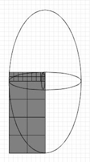
It might be helpful to diagram some spirals from the series of new rectangles that are similar to the golden rectangle.

What is the pattern?
What is the pattern in the progression of ratios for rectangles with features similar to the golden rectangle?
In my previous blogs on rectangles I showed that the golden rectangle is not so distinctive in its feature that when a square section is removed, the remainder is another rectangle with the same proportions as the first. I described rectangles that when 2, 3, 4, 5, etcetera, square sections are removed, the remainder is another rectangle with the same proportions as the first.
Here is the pattern of ratios for this series.
(1+√5)/2 [The golden ratio]
1+√2
(3+√13)/2
2+√5
(5+√29)/2
3+√10
(7+√53)/2
4+√17
(9+√85)/2
5+√26
(5+5*√5)/2
6+√37
These are the ratios of long side to short side for rectangles that, starting with the golden rectangle, are in proportion such that if one, two, three, etcetera, unit rectangles are removed, the remaining rectangle is in the same proportion as the original. What's going on here?
Review of art and architecture using the golden ratio
Any number of artists and architects have used the golden rectangle to guide the proportions of their works. What if you skewed these works so that their proportions conformed not to the golden ratio, but one of the other ratios that have similar properties? For example, take a painting by Mondrian or a building by Le Corbusier. Rescale the long dimension so that it conforms to one of the other ratios that exhibit features similar to the golden ratio.
 |  |
| Original in the proportions of a golden rectangle | Rescaled to the proportions of a "green rectangle" |
A golden rectangle problem to solve
In my previous blogs on rectangles I showed that the golden rectangle is not so distinctive in its feature that when a square section is removed, the remainder is another rectangle with the same proportions as the first. Similarly, I described a rectangle that when two square sections are removed, the remainder is another rectangle with the same proportions as the first. This can be carried on, infinitely I assume, so that there exist rectangles that when 3, 4, 5, etcetera, square sections are removed, the remainder is another rectangle with the same proportions as the first.
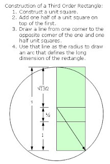
The rectangles I described can be constructed by adding one half unit squares, in series. First you construct a unit square, and then add one half of a unit square on top of the first. Then you draw a line from one corner to the opposite corner of the one and one half unit squares. Then you use that line as the radius to draw an arc that defines the long dimension of the rectangle. To create more rectangles in the series you add one unit square, then one and a half, then two, etcetera.
The problem to solve is to find the formulas (ratios for the long to short sides) for rectangles that are generated in a different series. That is, the golden rectangle is constructed by drawing a line across a half unit square. So, what are the formulas for a series of rectangles constructed by first drawing a line across a third, then a fourth, a fifth, a sixth, etcetera, of a unit square?
The first twelve of an infinite series of rectangles
In my previous blogs I showed that the golden rectangle is not so distinctive in its feature that when a square section is removed, the remainder is another rectangle with the same proportions as the first. Similarly, a feature of the "green rectangle" that I described is that when two square sections are removed, the remainder is another green rectangle with the same proportions as the first. This can be carried on, infinitely I assume, so that there exist rectangles that when 3, 4, 5, etcetera, square sections are removed, the remainder is another rectangle with the same proportions as the first.
Each of these series of rectangles can be described by a formula or ratio of long side to short side, similar to the golden ratio. The golden ratio can be expressed algebraically as:
(a+b)/a = a/b, where a is the long side and b is the short.
The rectangles with similar features can be described algebraically simply by subtracting an integer number of short sides from the denominator of the right side of the equation.
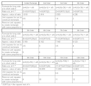
Here are features of the first twelve such rectangles, starting with the golden rectangle.
Construction of an 8th order rectangle:
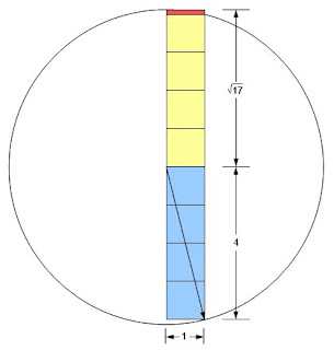
An 8th order rectangle with a short side of one has a long side of 4 plus the square root of 17. The ratio of long side to short side is therefore approximately 8.1231056. Removing 8 unit squares leaves the red rectangle, which has a short side of approximately 0.1231056 and a long side of 1. The new rectangle ratio of long side to short side is therefore approximately 1/0.1231056 or 8.123107.
Each of these series of rectangles can be described by a formula or ratio of long side to short side, similar to the golden ratio. The golden ratio can be expressed algebraically as:
(a+b)/a = a/b, where a is the long side and b is the short.
The rectangles with similar features can be described algebraically simply by subtracting an integer number of short sides from the denominator of the right side of the equation.
Here are features of the first twelve such rectangles, starting with the golden rectangle.

Construction of an 8th order rectangle:

An 8th order rectangle with a short side of one has a long side of 4 plus the square root of 17. The ratio of long side to short side is therefore approximately 8.1231056. Removing 8 unit squares leaves the red rectangle, which has a short side of approximately 0.1231056 and a long side of 1. The new rectangle ratio of long side to short side is therefore approximately 1/0.1231056 or 8.123107.
Saturday, October 27, 2007
Typical feature of some rectangles, including the Golden Rectangle
In a previous blog I showed that the golden rectangle is not so distinctive in its feature that when a square section is removed, the remainder is another rectangle with the same proportions as the first. Similarly, a feature of the "green rectangle" that I described is that when two square sections are removed, the remainder is another green rectangle with the same proportions as the first. This can be carried further, so that there exists a rectangle that when three square sections are removed, the remainder is another rectangle with the same proportions as the first.
Two quantities (positive numbers), a and b, are said to be in the golden ratio if (a+b)/a = a/b. In my previous blog I proposed that two quantities, a and b, be in the green ratio if (a+b)/(a-b) = a/b. The golden rectangle has been declared to be distinctive in that when b is removed from a, the ratio of b/(a-b) is the same as a/b. I showed that this feature is not so distinctive. That is because my green rectangle has the feature that when 2b is removed from a the ratio of b/(a-2b) is the same as a/b.
I will now define a new, "third order", rectangle whose side, a and b, are in the ratio of (a+b)/(a-2b) = a/b. If we define this ratio as τ, the Greek letter tau, this leads to:
τ² - 3τ - 1 = 0
The only positive solution to this equation is:
τ = (3 + √13)/2, or 6.606 (approximately).
Here's the calculation:
(a+b)/(a-2b) = a/b = τ
The right equation shows that a = bτ, which can be substituted in the left part, giving:
(bτ + b)/(bτ - 2b) = bτ/b
Canceling b yields:
(τ + 1)/(τ - 2) = τ
Multiplying both sides by (τ - 2) and rearranging terms leads to:
τ² - 3τ - 1 = 0
The only positive solution to this quadratic equation is:
τ = (3 + √13)/2 = approximately 3.303
A not so distinctive feature of the golden rectangle is that when a square section is removed, the remainder is another rectangle with the same proportions as the first. Similarly, a feature of the green rectangle is that when two square sections are removed, the remainder is another green rectangle with the same proportions as the first. Now I will show that a feature of the third order rectangle is that when three square sections are removed, the remainder is another rectangle with the same proportions as the first.
Proof that b/(a-3b) is the same as a/b.:
If the long side of the remaining rectangle is 1, the short side is (3 + √13)/2 - 3.
1 / ((3 + √13)/2 - 3) =
1 / ((3 + √13)/2 - 6/2) =
1 / ((-3 + √13) /2)=
2/(-3 + √13) =
2( √13+3)/( √13-3)( √13+3) =
(2√13+6)/( 13-9) =
(3+√13)/2

Tuesday, October 23, 2007
Green Rectangle
In an earlier blog I questioned the assumption that the golden ratio or golden rectangle somehow contributes to an artwork's beauty, proportion or harmony. Since then it occurred to me that the golden rectangle might not be so special if you could show that other rectangles have similar properties.
I now propose an alternative to the golden rectangle, which I call the green rectangle. Instead of a rectangle whose side lengths are in the golden ratio, that is, approximately 1:1.618, I propose a rectangle whose side lengths are in the ratio of approximately 1:2.414, the green ratio.
Two quantities (positive numbers), a and b, are said to be in the golden ratio if (a+b)/a = a/b. I propose that two quantities, a and b, be in the green ratio if (a+b)/(a-b) = a/b. If we define this ratio as χ, the Greek letter chi, this leads to:
χ² - 2χ - 1 = 0
The only positive solution to this equation is:
χ = 1 + √2, or 2.414 (approximately).
Here's the calculation:
(a+b)/(a-b) = a/b = χ
The right equation shows that a = bχ, which can be substituted in the left part, giving:
(bχ + b)/(bχ - b) = bχ/b
Canceling b yields:
(χ + 1)/(χ - 1) = χ
Multiplying both sides by (χ - 1) and rearranging terms leads to:
χ² - 2χ - 1 = 0
The only positive solution to this quadratic equation is:
χ = 1 + √2 = approximately 2.414
A green rectangle is a rectangle whose side lengths are in the green ratio. I call this the green rectangle because it is leaner than the rather squat golden rectangle. Stood vertically, a green rectangle is taller, thinner, more like the ideal modern figure. Projecting the short side to a square base yields a tall box with a smaller footprint, as well.
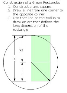
A not so distinctive feature of the golden rectangle is that when a square section is removed, the remainder is another rectangle with the same proportions as the first. Similarly, a feature of the green rectangle is that when two square sections are removed, the remainder is another green rectangle with the same proportions as the first.
Proof:
The long side of the remaining rectangle is 1 and the short side is 1 + √2 - 2.
1 / (1 + √2 - 2) =
1 / (-1 + √2) =
(-1 - √2)(1) / (-1 - √2)(-1 + √2) =
(-1 - √2) / (1 - √2 + √2 - 2) =
(-1 - √2) / -1 =
1 + √2
Double square removal can be repeated infinitely, which leads to an approximation of what I will call the "green spiral", similar to a golden spiral. Compared to a golden spiral, a green spiral is stretched, being made from quarter-ellipses, rather than quarter-circles. At any rate, using quarter-circles to generate a spiral is actually called a Fibonacci spiral, and only approximates a golden spiral. Perhaps a green spiral approximates a hyperbolic spiral — the math is beyond me. [Add a drawing of a green spiral and a hyperbolic spiral (with a=?) around the same center point.]
I don't deny that the golden rectangle is aesthetically pleasing. However, I don't think there's any proof that a connection exists between the math of the golden ratio and the beauty of a regular rectangle with proportions not too wide, not too thin.
I now propose an alternative to the golden rectangle, which I call the green rectangle. Instead of a rectangle whose side lengths are in the golden ratio, that is, approximately 1:1.618, I propose a rectangle whose side lengths are in the ratio of approximately 1:2.414, the green ratio.
Two quantities (positive numbers), a and b, are said to be in the golden ratio if (a+b)/a = a/b. I propose that two quantities, a and b, be in the green ratio if (a+b)/(a-b) = a/b. If we define this ratio as χ, the Greek letter chi, this leads to:
χ² - 2χ - 1 = 0
The only positive solution to this equation is:
χ = 1 + √2, or 2.414 (approximately).
Here's the calculation:
(a+b)/(a-b) = a/b = χ
The right equation shows that a = bχ, which can be substituted in the left part, giving:
(bχ + b)/(bχ - b) = bχ/b
Canceling b yields:
(χ + 1)/(χ - 1) = χ
Multiplying both sides by (χ - 1) and rearranging terms leads to:
χ² - 2χ - 1 = 0
The only positive solution to this quadratic equation is:
χ = 1 + √2 = approximately 2.414
A green rectangle is a rectangle whose side lengths are in the green ratio. I call this the green rectangle because it is leaner than the rather squat golden rectangle. Stood vertically, a green rectangle is taller, thinner, more like the ideal modern figure. Projecting the short side to a square base yields a tall box with a smaller footprint, as well.

A not so distinctive feature of the golden rectangle is that when a square section is removed, the remainder is another rectangle with the same proportions as the first. Similarly, a feature of the green rectangle is that when two square sections are removed, the remainder is another green rectangle with the same proportions as the first.
Proof:
The long side of the remaining rectangle is 1 and the short side is 1 + √2 - 2.
1 / (1 + √2 - 2) =
1 / (-1 + √2) =
(-1 - √2)(1) / (-1 - √2)(-1 + √2) =
(-1 - √2) / (1 - √2 + √2 - 2) =
(-1 - √2) / -1 =
1 + √2
Double square removal can be repeated infinitely, which leads to an approximation of what I will call the "green spiral", similar to a golden spiral. Compared to a golden spiral, a green spiral is stretched, being made from quarter-ellipses, rather than quarter-circles. At any rate, using quarter-circles to generate a spiral is actually called a Fibonacci spiral, and only approximates a golden spiral. Perhaps a green spiral approximates a hyperbolic spiral — the math is beyond me. [Add a drawing of a green spiral and a hyperbolic spiral (with a=?) around the same center point.]
I don't deny that the golden rectangle is aesthetically pleasing. However, I don't think there's any proof that a connection exists between the math of the golden ratio and the beauty of a regular rectangle with proportions not too wide, not too thin.
Monday, October 15, 2007
New York, O.C. artist, Allan McCollum
I attended the PSU art department's Monday Night Lecture, organized by faculty member Harrell Fletcher. The presenter, Allan McCollum, went all the way back to 1968, giving a chronological account of his projects.
McCollum overwhelmed me with his compulsions, making hundreds or thousands of similar objects. He has created thousands of Perfect Vehicle sculptures with the same shape, that of a Chinese ginger jar, but in different colors, and sometimes different sizes, from a few inches to 80 inches high. At other times, he obsessively researches, documents, or replicates interesting things that come his way, such as a Pompeii dog, or sand spikes. McCollum taps into visionary art or "art produced by self-taught individuals, usually without formal training, whose works arise from an innate personal vision that revels foremost in the creative act itself." (quote from the American Museum of Visionary Art, in Baltimore)
McCollum is creating a more refined version of visionary art. It's more calculated than folk art. I appreciate works by individuals who have an innate personal vision in them and it's got to come out. McCollum starts with the premise that he's going to create in an obviously obsessive manner, and he looks for an appropriate subject.
McCollum had justifications for each and every step along the way in his forty-odd year pursuit of obsessively repetitious projects. The justifications were generally about art, not about compulsion. His presentation attitude was somewhat mocking and sly, eliciting chuckles if not admiration.
Wednesday, October 10, 2007
Chicago installation artist Jean Marie Casbarian
I attended the PSU art department's Monday Night Lecture, organized by faculty member Harrell Fletcher. The presenter, Jean Marie Casbarian, produces highly personal installations. I thought her works could be promoted more accurately as photography incorporating some aspects of multi-media and installation art, rather than installation art incorporating photography.
I wondered if the personal side of her work has begun to take over the creative. She's researching, documenting, and drawing from her family history. I'm not sure that bits and pieces of information on the Aberdeen Proving Ground translates into interesting art. Sometimes, when we focus on finer detail (in this case the detail of Casbarian's life and family), the image becomes banal.
I wondered if the personal side of her work has begun to take over the creative. She's researching, documenting, and drawing from her family history. I'm not sure that bits and pieces of information on the Aberdeen Proving Ground translates into interesting art. Sometimes, when we focus on finer detail (in this case the detail of Casbarian's life and family), the image becomes banal.
Tuesday, October 9, 2007
Terrie Sultan, Chuck Close Prints: Process and Collaboration
I attended Terrie Sultan's talk about the exhibition of Chuck Close prints at the PAM. Sultan organized the exhibit, which will be in ten cities. Her presentation and the exhibit are both heavy on Close's process and his collaboration with printers. Sultan emphasized the fact that Close considers his work minimalism, and does not identify with representational or figurative artists. A portraitist he's not.
I see him as sort of a human digitizer, since no matter what medium he works in he almost always manually rasterizes images. But Close's process is a complex mix of digital and analogue. Sultan repeatedly used the word, integer, to describe the smallest unit component of each image. When Close communicates to his printers he gives each unit an integer. Depending on the process each unit may be unique and exactly repeatable, or each unit may be communicated as an integer, but rendered by a continuously variable, analogue process. Sometimes it gets complicated, mixing the analogue with the digital. For example, Close directs the production of hand-made pulp paper prints. The pulp is colored to create a gray scale, so each unit identified by the same integer is the same color if not the same exact shape. In contrast, sometimes Close directs the production of prints made up of units that are themselves small, irregular, concentric, circular or elliptical marks inside of squares. There are a finite number of colors associated with each mark, but an infinite or continuously variable number of ways to make the marks within each unit square. The spitbite prints are another example in which units are given an integer representing the number of seconds to allow an area to etch. But the actual rendering of each unit may be analogue since using a stop watch to direct a printer when to stop etching makes each unit unique, and infinitely varied.
My estimation of Close was increased substantially by the show and Sultan's talk. I admire Close because he is so persistently concrete. We can describe his intentions without resorting to superficial art jargon.
I admire him because he seems to work so well with his collaborators. He achieves more by cooperating completely with the printmakers, and they with him.
I don't always like his product. Some of the pieces produced in fabric and hand-made paper seem more craft than art to me. But even then I admire the fact that Close is so willing to attempt the innovation.
Tuesday, October 2, 2007
Subscribe to:
Comments (Atom)
